THE DESIGN “FOR BETTER DAYS”: INTERVIEW WITH DESIGNER MATTEO RAGNI

To clarify to everyone the form of design he professes, Matteo Ragni decided to do so using the slogan “We Design for better days” that summarises all the creative energy and optimism for the future that fuels his enthusiasm.
There is a world out there that must be observed, not ignored by hiding behind the word design. In fact the designer draws inspiration from relationships with the world, its people and its enterprises, captivating the sense of an ethical train of thought that accompanies him in every project decision he makes. The design is already there, in the minds of the designers which are always packed with ideas. But the ideas only function when they are conveyed in a profound and feasible relationship with the other and the surrounding environment.
Recently Matteo Ragni showed us how a manhole cover (the “Sfera” model designed for Montini) can be interpreted in an expressive and ironic manner, and for this intuition one can be awarded a Compasso d’Oro (the second of his career).


The fact that he is exceptionally future-orientated is also seen in another of his projects TobeUs (brand of hand-made wooden cars) highlighting the value of boosting awareness when using objects and the idea that toys are so important that it is better if they contain ideas, values and hope that help imagine a future where consumption becomes a thought and choice.


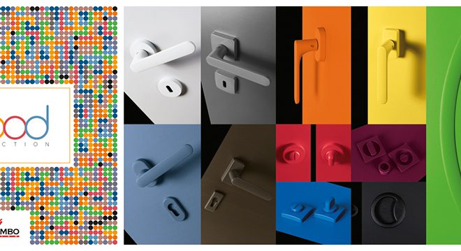
In his studio in Milan, Matteo Ragni talked about the handle he designed for Colombo Design, one of the new entries in this year’s collection.
The collaboration with the designer started at the Fuorisalone 2014, when Colombo Design took part in the “Wood&More” project for the Emilia based company Alpi, an invitation to observe materials from a new and wider perspective, opening up to new experiments such as, for instance, combining different elements.

The handle in question is called Spider and is made from wood and brass, two ingredients which, with addition of a good dose of design, have created a product with a two-fold soul: the more austere lines of the front become softer towards the back, where the hand grasps the handle. Classic proportions searching for an impeccable project where typological innovation strives to achieve the perfect match with the material of the doors.

Where did the design of the Spider handle all start?
As I see it, a handle should be a discrete partner in our life, it should do its job without making too much “noise” about it, so it does not become tiresome over time. In this case however, I also strived to create something unexpected: a more austere front design, reassuring and neutral, that hides a small surprise. Once you grasp the handle, your hand embraces a rounded section which makes it extremely pleasant to hold.
In the video interview you mentioned you used a “quadroide” shape not only for our handle, but also in the design of other products: can you tell us about one in particular?
The large ellipse, that I mistakenly call a “quadroide”, is an obsession of mine that I have had for years; not a circle, not a square, not straight line. An emblematic project is the Vigorelli wrist watch I designed for Lorenz. The case is “quadroide”, whilst the inner dial is a circumference; the joining of the two shapes creates a satellite dish that resembles the famous cycle racing track in Milan.

You described the use of Alpi wood when making the Spider handle as a way to emphasise the idea of total design: what do mean by that?
I have always tried to create small short circuits in my designs; for instance I like the idea that a warm and natural material such as wood can “take possession” of other surfaces like that of a handle which usually has a rather “cold” finish.
This year I also experimented with a brand new application using mirrored class veneers in a series of furniture for Tonelli, achieving extremely interesting perceptive and tactile effects.
Two months ago you were awarded the second Compasso d’Oro of your career for the design of a manhole cover: which element of urban design do you think cities should invest more in?
First and foremost the benches in urban centres which are normally positioned in areas without any common sense at all (think of the benches placed in the middle of large squares under the scorching sun without a hint of shade or trees). I believe there is room for completely new designs in this sense that encourage interaction among citizens and increase the level of comfort and exploitability at different times of the day and in different seasons.
Urban design is the feather in the cap of any city; in this sense, which city do you admire most?
Personally, I adore the street manhole covers in New York, for their texture and, above all, their size, in addition to the renowned smoke effect that always makes me think that there is another secret city underground.
Describe your style as you would to a friend.
It is not a question of style but of common sense.
Is there anything that could never become an object of design?
All objects are based on design, the difference being that some have a good design, others have a bad design.
Which is the first and last object of design that you used yesterday?
The first was my i-Phone when I turned my alarm off, the last was my i-Phone to turn it off before going to sleep.
What do you know now that you wish you had known when you were 21?
Me at 40.
Can you describe your next project?
A home nestled in the rolling Pesaro hills where I can live and work with my family, my studio staff and young talents who share my passion for good projects (a very near future that I started to enjoy just a few days ago).
And what do you see for the future of handles?
I see handles, definitely without traditional locks (no more bunches of keys in your pocket at last!), perhaps less physical but definitely brimming with significance.


